Let's face it, a stack of bulleted lists has never maintained an audience's interest. The product is uninspired in its best light--confusing and cluttered in its worst.
However, lists are a necessary evil. Using the text to support the material that you're discussing tells the audience that you've seriously considered your key points. Delivering these points in a polished, concise way is an art-form. Taking the extra time shows that you respect your average listener's time and attention span.
So, what are our options?
1. GO HORIZONTAL

Instead of meeting expectations, exceed them. Avoid a left aligned list; take advantage of the right side of the page and spread out your ideas.
2. USE IMAGES

Don't limit yourself to just verbalizing, when visualizing your ideas can take your presentation to the next level. Use images to help your audience understand and remember the relationship between your points.
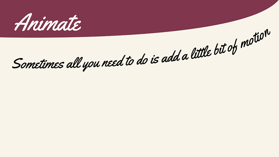
3. ANIMATE

Sometimes all you need to do is add a little bit of motion in order to catch someone’s eye. Powerpoint has a healthy selection of animations including fade in, fly in, appear, etc. The process is easy- select your text, click the ‘animations’ pane, and choose an animation of your liking. One of my personal go tos is the fade. It's simple and effective, but doesn't distract your audience.